Novelties
To complement your keycap set, you may want to augment it by creating a Novelty Kit. This can often significantly increase the appeal of your set, helping to reinforce your chosen theme.
Kitting
If you’re experienced in creating novelty kits you can skip this section, but for everyone else here is some guidance on how to approach kitting your novelty kit. There are a few main ways people use novelty keys on mechanical keyboards:
- Replacements for (primarily bottom row) modifiers
- Replacement for the R4 Escape key (common on a 60% or 65% layout)
- 1u macro keys for ‘XT’-style key clusters, or function row keys
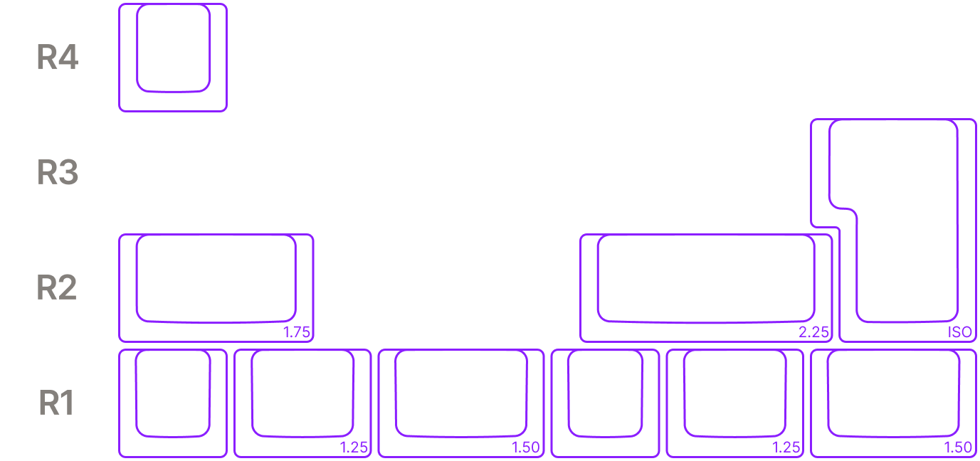
This means your safest bets for keys to include in a novelty kit are:
- R4 1.0u
- R1 1.0u
- R1 1.25u
- R1 1.5u
- R2 1.75u (i.e. ‘Caps Lock’)
- R2 2.25u (i.e. ANSI Enter)
- ISO Enter
Typically for the R1 keys, you should offer one of each size for each novelty design you offer; if you only have one novelty design for this key, offer at least two of each size.
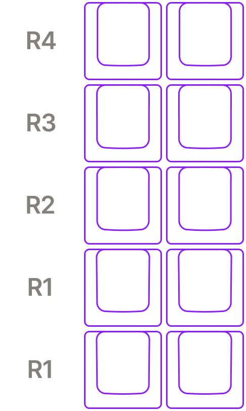
For macro keys, there are a couple of different ways of approaching this. You can either provide a number of R4 1.0u keys (which would for example allow replacing all four keys above the numpad cluster on a 105-key layout), or you can provide 1-2 keys per row from R4-R2, and 2-4 keys on R1 (this allows for a 2x5 arrangement as seen in an XT key cluster). Some users are happy to use all-R4 keys in a vertical arrangement for an XT key cluster (as is often done with F-row keys), so you could alternatively provide 5-10 R4 1.0u keys to achieve the same outcome.

Custom Keys
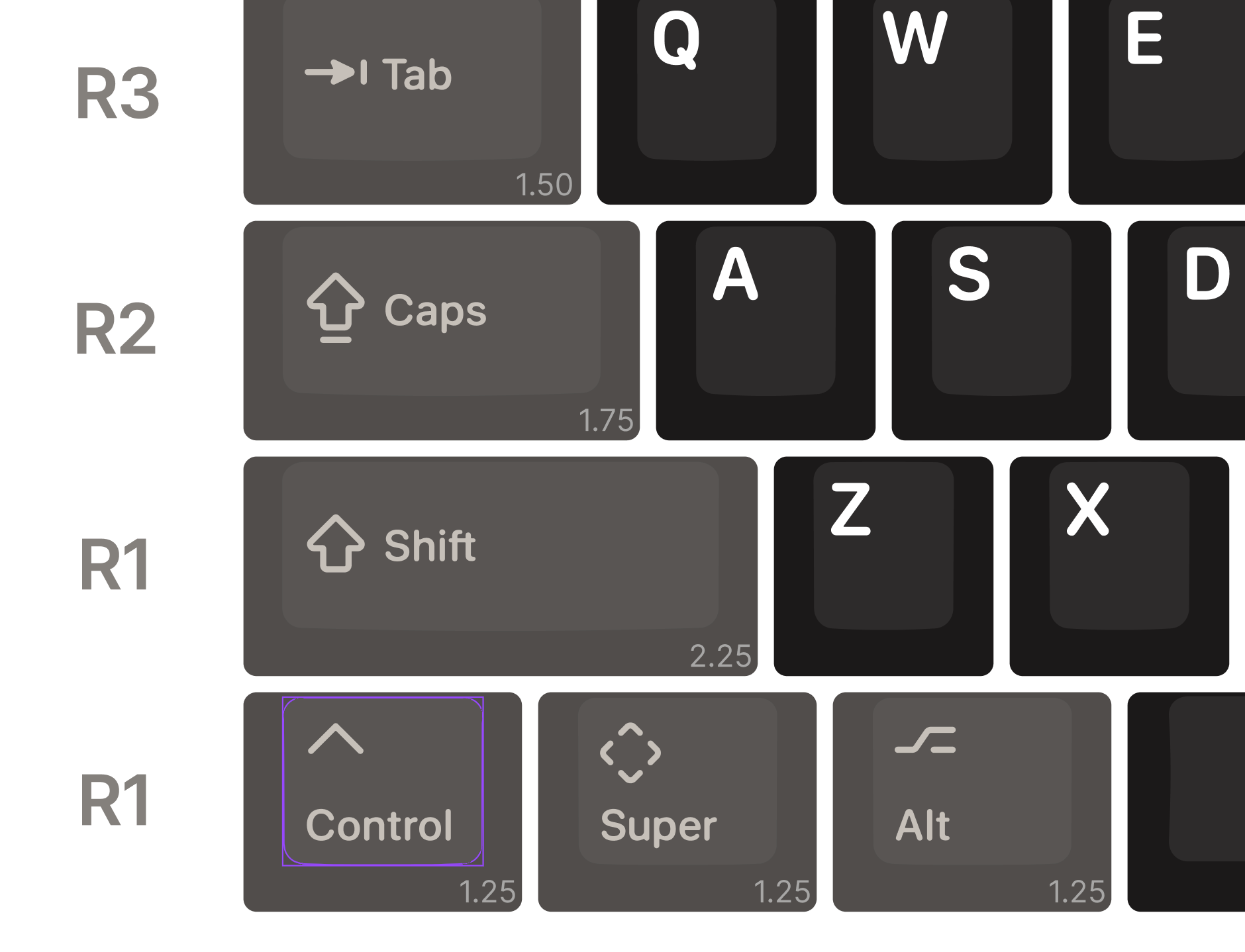
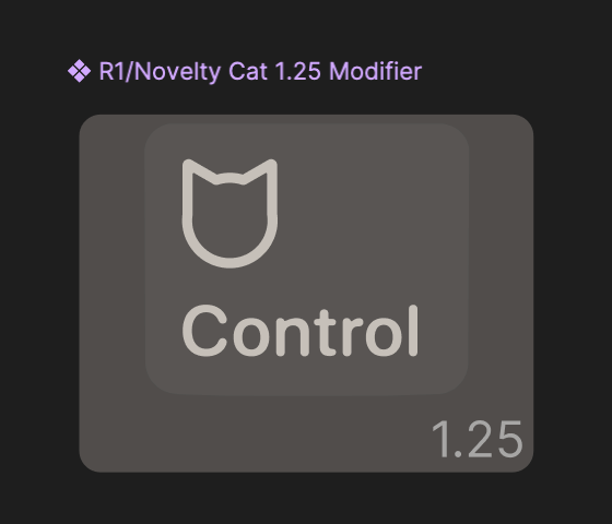
The best way of creating your new kit is to start out by finding instances of the size and row of keycap you want to use within the KAP Template file, and creating a new component based on it. Let’s say for example we want to create a R1 1.25u novelty key; first Ctrl Click in the middle of the left-most Control key on the bottom row of the Base Kit.
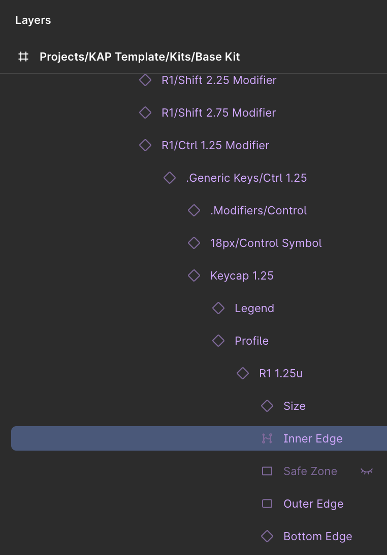
In the left-hand panel you should see a selected layer called Inner Edge,
which sits nested within several other components, leading up to one called
R1-Ctrl 1.25 Modifier. This is the component you want to copy, so select it
and press Ctrl C to copy it.
Most keys within the KAP Template follow the same overall structure, but a
couple of them are exceptions to the rule: notably the Escape keys, Enter 2.0
Vertical key (used in the Numpad) and NumLock key. To make it easier to switch
between modifier variants for these keys, the instances you will find within the
Base Kit templates wrap around the actual keycap instance. So for example, the
Escape Accent key on R4 is called R4-Esc Accent but the actual key component
within it will be called R4-Esc Icon Accent (or R4-Esc Text Accent, if
you’ve switched to that variant). If you’re using one of these as the basis for
a new novelty, ensure you copy the key inside the outer component (e.g.
R4-Esc Icon Accent).
Create a new page within your Figma file by clicking the + icon at the upper
part of the left-hand panel; give it a name like Novelties, then paste your
target component with Ctrl V. For now this is just another
ordinary instance of the R1-Ctrl 1.25u Modifier component, so let’s turn it
into a new component, independent of its origins.
To do this, first we want to Detach Instance with Alt Ctrl B, then create a new component from it with Alt Ctrl K. At this point you should give it a suitable name, following
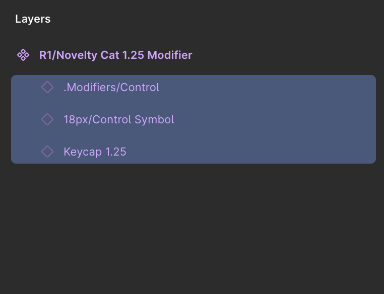
the same naming structure, e.g. R1-Novelty Cat 1.25 Modifier.
By convention, some keycap components will have a suffix of Modifier or Accent to denote that they use the Modifier or Accent colors; if you’re planning on using Modifier or Accent colors for your novelties, choose the appropriate name here. If on the other hand you’re using the same color scheme for alpha keys and modifiers, feel free to drop the suffix from your keycap component.
Within your newly-created component, the first (and only) thing inside it will
be an instance of a component .Generic Keys/Ctrl 1.25; select it, and as
before press Alt Ctrl B to detach the
instance, then ⇧ Ctrl G to ungroup its contents.
Once this is done, you should have something that looks a little like this:
You can select each of these items and see how it fits into the component, and if you choose to, you can remove them. If however you’re following the standard modifier key layout (recommended so your keys fit the overarching aesthetic of KAP Legend System) and are planning on substituting the default icon with something of your choosing, you should probably keep at least the icon in place to use as a placeholder. We’ll discuss how to go about this in the section on Icons, below.
Icons
The standard layout within KAP Legend System keycaps uses an 18×18 frame size for icons (although in some special cases, parts of the icon may extend beyond the edges of this frame). If you’re creating a novelty which includes text, we recommend you start with this same 18×18 frame for your icon; for icon or pictographic-only novelty keys, feel free to use whatever size makes sense for you.
For now we’ll assume you’re creating a set of novelty keys all of which will
have the same design, at different sizes (for 1.0u, 1.25u and 1.5u). First,
create a new frame that will serve as the canvas for your icon by pressing
F then dragging out an 18×18 frame. In the right-hand panel,
uncheck Clip content, and remove the default Fill color of #FFFFFF by
clicking the minus icon to the right.
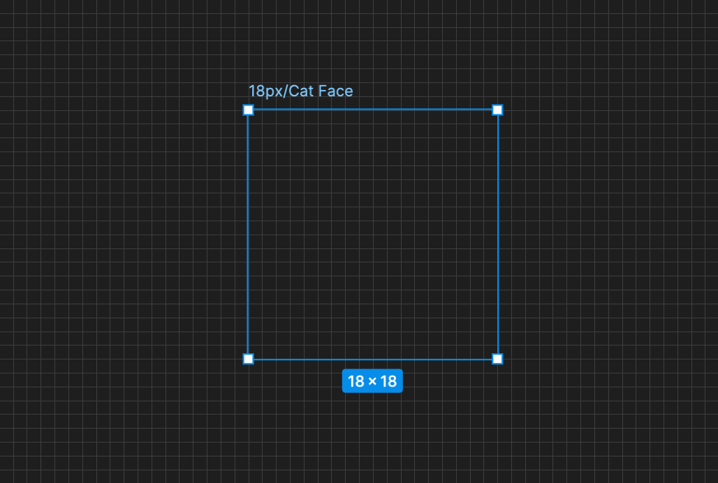
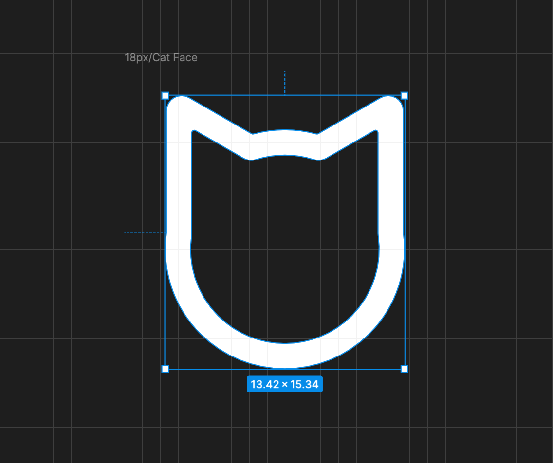
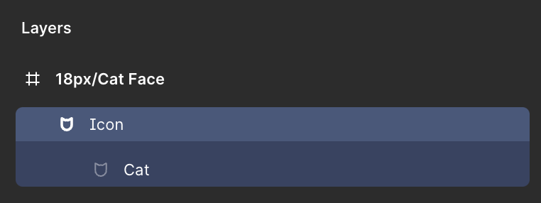
Now, add an icon within the frame and call it something like 18px/Cat Face.
You can draw this however you like (with important consideration to the
Tolerances, discussed below), but you should ensure the icon is grouped within
a Boolean Union — you do this with ⇧ Alt U —
name this union Icon, and in the Appearance properties in the right-hand
panel set the border radius to 0.14. This will ensure that any sharp edges
from your design are smoothed out, and that the icon has a consistent fill color
when substituted for any other icon instance.
If you’re using Keyreative’s hybrid doubleshot approach and have an icon which
uses multiple different colors, you can skip the step to group all of your
icon’s components into a single Boolean union. You should still ensure that each
layer has a border radius of 0.14, however.
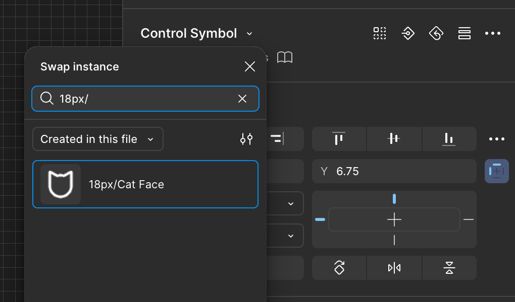
You can now convert this icon into a component with Alt Ctrl K. Returning to your keycap component, select the component
instance within it called 18px/Control Symbol, and then at the top of the
right-hand panel click Control Symbol to reveal the popover for Swap
instance. From the dropdown within this popover, select Created in this file,
then type 18px/ and the new icon should appear in the popover, so click to
select it.
Your component should then update, and if you handled the naming and Boolean union correctly, the icon will automatically use the existing modifier color — this is particularly useful for avoiding the need to update all your instances whenever you change their icons.
Modifier Text
KAP Legend System makes use of heavily-modified letterforms, which have been individually tweaked at different scales to meet engineering constraints. They require careful alignment, both to be correctly positioned and to ensure the gaps between letters is sufficient for manufacture. As such, there isn’t an individual font you can install to create custom text legends of the same quality as the default legends. For now, the easiest way to get custom modifier text onto a key is to reach out to kapowaz on Discord with the specific legends you need to be created so they can be supplied to you.
Tolerances
There are several important engineering tolerances you must stick to when creating custom legends — whether they’re icons, custom art or custom text. These are important to ensure that your design can be physically manufactured and turned into an insert for injection molding. The five key metrics you should pay attention to are:
- Line width — the width of individual strokes on letters or icons
- R-angle — the smallest possible radius of internal corners within a legend
- Interval — the gap between individual stroked or filled elements within a legend
- Enclosed area — the size of any internal gaps within legends, e.g. the centre of a letter O
- Icon area — the relative proportion of the keycap legend that is filled
For each of these tolerances values are listed both in millimetres and pixels, the latter being the value you should use in Figma.
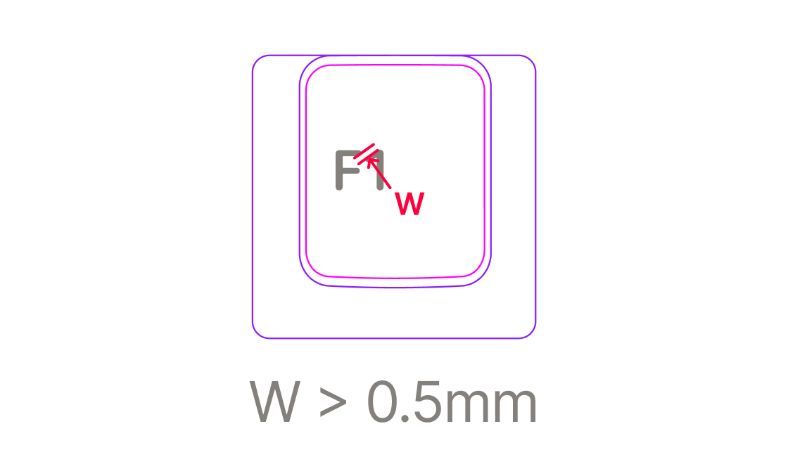
Line width
The width of individual strokes on letters or icons. Note that the standard
stroke width for icons and most legends is 0.5mm (1.42px in Figma); for
consistency you should usually aim to use this value for your strokes.
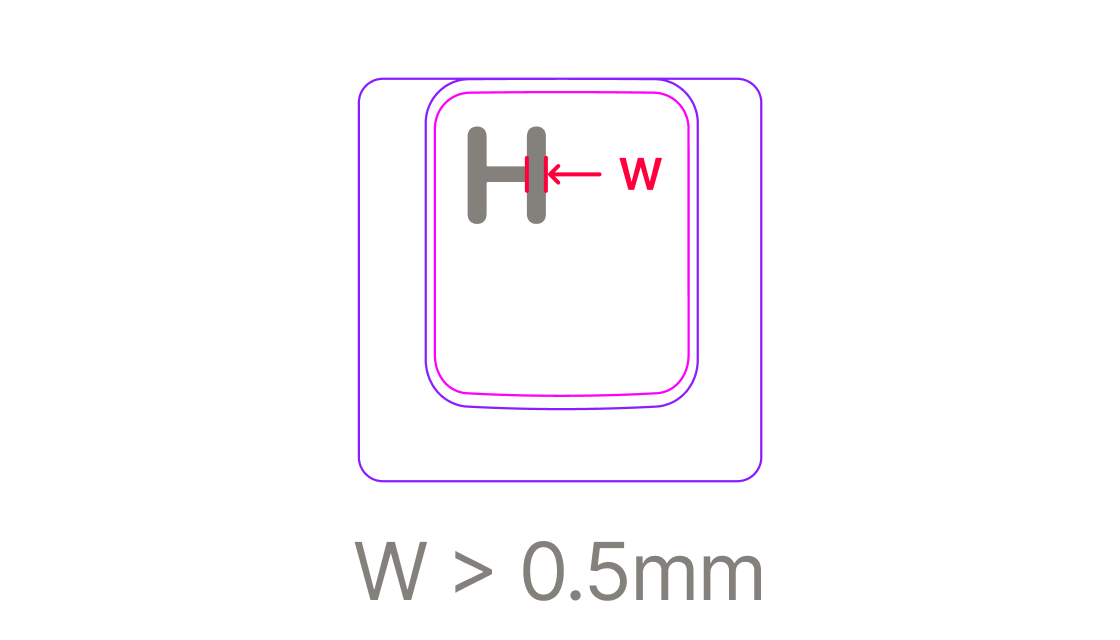
- Ideal:
>0.5mm/1.42px - Good:
>0.32mm/0.91px - Difficult
>0.22mm/0.62px
Stroke widths below 0.22mm in thickness might be possible, but should be
avoided.
R-Angle
This metric concerns the sharpness of any internal corners on your legend. It is
best visualised as the corner radius on a sharp point, measured in mm. You can test this
in design tools by checking if a circle with the desired radius can fit snugly
inside the internal corner, covering the whole area the corner extends into.
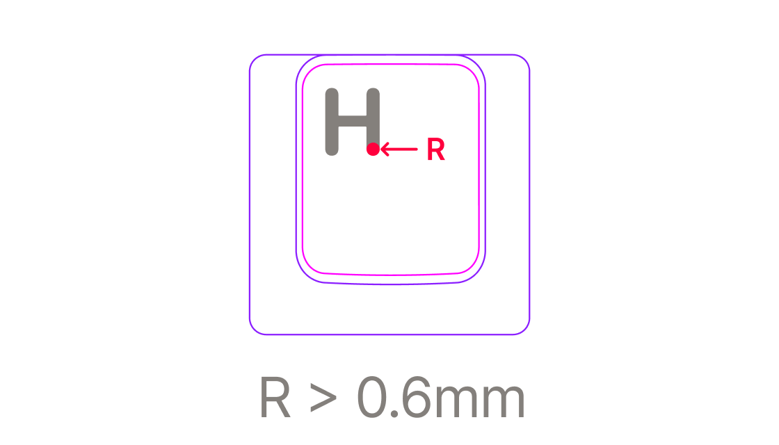
- Ideal:
>0.6mm/1.7px - Good:
>0.3mm/0.85px - Difficult:
>0.1mm/0.28px
Corner radii below 0.1mm should be avoided.
Interval
Similar to line width, this is a simple metric for the gap between filled areas within a legend. You can test whether your legends meet this requirement by creating a circle of the chosen diameter and seing whether there are any places within your legend where it can overlap two separate elements of the legend simultaneously.
- Good:
>0.5mm/1.42px - Difficult:
>0.3mm/0.85px
Interval gaps of below 0.3mm between filled areas should be avoided.
Enclosed Area
To ensure legend molds can be manufactured, the size of non-filled, enclosed areas should be above a certain minimum size.
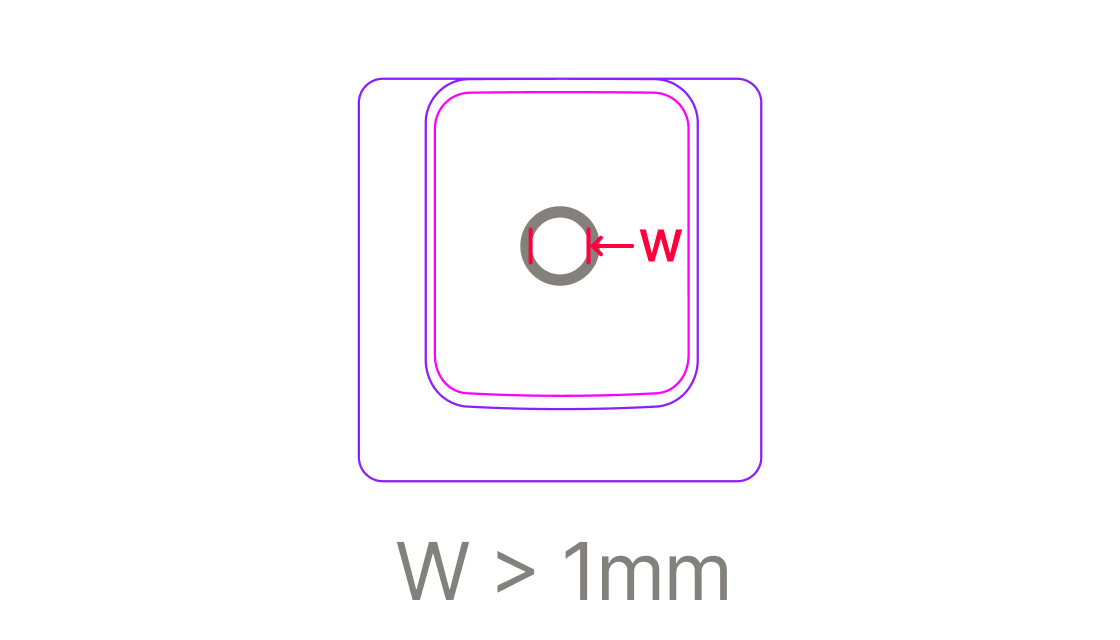
- Ideal:
>1mm/2.84px - Good:
>0.5mm/1.42px - Difficult:
>0.25mm/0.71px
Enclosed areas below 0.25mm wide between filled areas should be avoided.
Icon Area
This relates to the relative proportion of the keycap legend that is filled compared to the base keycap color. Provided your legend doesn’t fill a large amount of the keycap surface you should be comfortably within this constraint, but it should be given consideration to if you have an especially large legend for any reason.
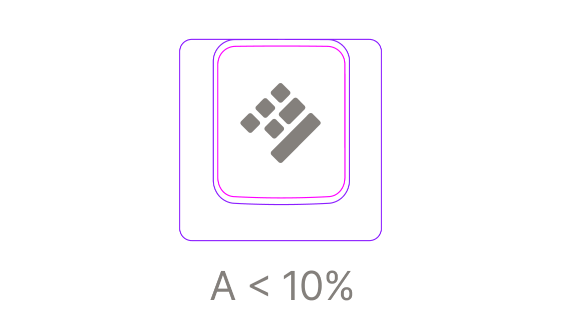
- Ideal:
<10% - Good:
<60% - Difficult:
<80%
Safe Area
As well as tolerance constraints, custom legends must be a safe distance from
the edge of the keycap top surface. When creating custom legends you must ensure
that your legend is no closer than 0.3mm / 0.85px to this line.
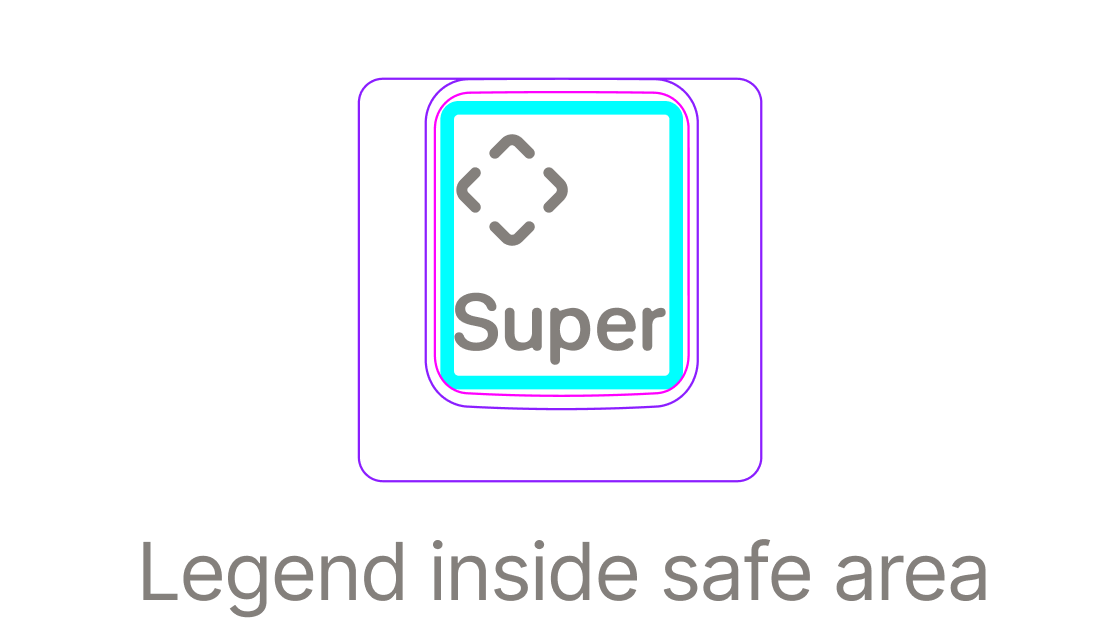
You can visualise this safe area within your individual keycap components by
turning on a (hidden) layer called Safe Area within the keycap Profile
sub-component. To find this component, Ctrl Click on the main
keycap surface to select the layer called Inner Edge; the Safe Area should
be immediately below this, but hidden. By default it will be displayed with a
thin cyan-colored stroke, but to accurately indicate the area your legend cannot
encroach upon, you should change the Stroke properties to a width of 1.7, with
the stroke aligned to the Inside of the layer.